Now this looks a lot better!

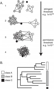
A network representation (A) vs. a tree representation (B) of protein sequence similarities. Click for larger picture & caption. Source: doi:10.1371/journal.pone.0004345
In any data-rich science, data visualization is of prime importance. Finding ways to visually depict data is challenging, as we have opposing demands: we would like to see the data in the whole, but also be able to zoom in and analyze the details; we would like to know how the many details add up to affect the big picture.
There are already templated ways of presenting molecular biology data. Gene expression data is typically shown in clustered heat maps; phylogenetic data is shown in trees (one of the oldest ways of representing data rich sets in a graphic manner — dating back to Linnaeus in the mid 18th century, although he used it for taxonomy), and sequence similarities are shown in color-coded multiple sequence alignments and as trees. Protein-protein interaction data is shown as graphs with the nodes being individual proteins and vertices drawn between interacting proteins.
But sometimes, borrowing method A to represent data of type B has unusual benefits.
In a paper published yesterday in PLoS One, Patsy Babbitt’s group from the University of California San Francisco instruct us on why we should try to represent multiple protein sequence similarity data as graphs, with each node representing a single protein, and the edges representing some sort of similarity measure, like the BLAST e-value. If two protein sequences are similar above a certain threshold, they are connected with an edge. The edge length is weighted by the similarity measure. The more similar two sequences, the shorter is the edge connecting them. This similarity network carries more information than the traditional tree representation. In the authors’ words:
[…]we see the real promise of this technique as allowing a knowledgeable scientist to observe basic connections and clustering in a protein superfamily of interest in the context of orthogonal information.
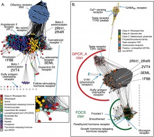
In a second step, the proteins can be color-coded based on taxonomic family or functional family. The color nodes and the distances provide a clear picture of relationships between families and within sequences of the same family.

Similarity networks depicting distant relationships between G-protein coupled receptors. From doi:10.1371/journal.pone.0004345
Bottom line: if you are using trees for visualizing mass sequence similarity data, you should seriously consider reading Babbitt’s paper, download Cytoscape, and try this out for yourself. Even if you are not using trees, but you wish to visualize this kind of data en masse, check this out. I only scratched the surface in this post, and their paper serves both as an interesting biological report, and as a short cookbook to be emulated.
Update: following Pawel’s comment, I added links to the CLANS paper and site. CLANS is another software that may be used for this kind of visualization. Thanks Pawel!
Holly J. Atkinson, John H. Morris, Thomas E. Ferrin, Patricia C. Babbitt (2009). Using Sequence Similarity Networks for Visualization of Relationships Across Diverse Protein Superfamilies PLoS ONE, 4 (2) DOI: 10.1371/journal.pone.0004345
CLANS Paper:
T. Frickey (2004). CLANS: a Java application for visualizing protein families based on pairwise similarity Bioinformatics, 20 (18), 3702-3704 DOI: 10.1093/bioinformatics/bth444
Get CLANS here:
http://bioinfoserver.rsbs.anu.edu.au/programs/clans/


Much of this functionality was already provided by CLANS (http://bioinfoserver.rsbs.anu.edu.au/programs/clans/ ), which is cited by this paper, although in a completely weird way (didn’t they read it?). It would be great if they provided scripts/plugins to adapt Cytoscape for such purposes – or am I missing the link?
@Pawel Szczesny
IMHO, the paper’s importance does not have to do with one method or the other: e.g. BioLayout predates CLANS by 3 years but that’s not the point; it’s not about method novelty. Rather, it is that this paper describes in detail the principle of using similarity networks as a visualization method, how to do it right, and what benefits we can derive from them + provides some interesting biological examples.
@Iddo
I agree – principles of using similarity networks as a visualization method were not described previously in such detail (biological examples were already provided in Tancred’s AAA+ paper). Although as far as I know they are tought on various bioinformatics courses.
@Pawel Szczesny
There is a plugin available from the Cytoscape plugin manager that integrates directly with the SFLD to browse and download all of the networks for SFLD superfamilies directly into Cytoscape. We hope to add additional tools or enhance SFLDLoader to provide additional capabilities in the near future.